I decided to go back and try and tackle the Car and Driver cover again for my revision assignment. I knew that this go around since I couldn’t get the specific font that they used that I would try and forego it all together – seeing as, without it, it just doesn’t necessarily look right.
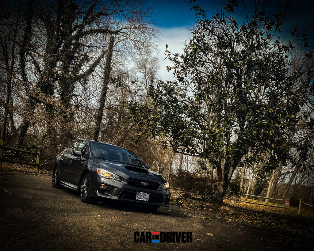
On top of that, I knew that I wanted to choose a different picture seeing as one I already had previously taken felt like cheating if I was “creating” the cover from scratch. I knew that I wanted to get a little bit closer to my car since I didn’t have text I needed to fit- and I wanted to do a LOT more editing. To be honest, I got half lucky that the first shot of my old car ended up coming out well enough and at the right time of day to where it didn’t need a lot of editing.
With this shot, however… whole different story. I did a dodge and burn effect to help create some more defining lines on my car or accentuate currently existing ones. I played with contrast, clarity, sharpness, grain… the list goes ON AND ON (seriously). In the end, I am pretty proud of what I have created. This seems like a junior version of what they would do for their non-major shoots that wouldn’t go on covers.
Overall, this seems like a really good start for me into car photography. I’ve always wanted to do it and just never pulled the trigger. For a FIRST edit… this is more than above average so I’m not gonna kick myself too hard. What I’m looking forward to learning next that I wasn’t able to figure out this time is how to have individual pieces of the C&D logo change brightnesses while keeping it on the same layer (if possible). Anyway, enjoy the finished product!